Smithwick’s, a local hero ale born out of Kilkenny that over the years lost its character and alienated itself to an ageing audience. We were set the task of making this historic drink relevant amongst the craft beer revolution. Inspired by the brands 300 year traditions we aimed to illustrate the brand with character and wit, celebrating its authenticity.
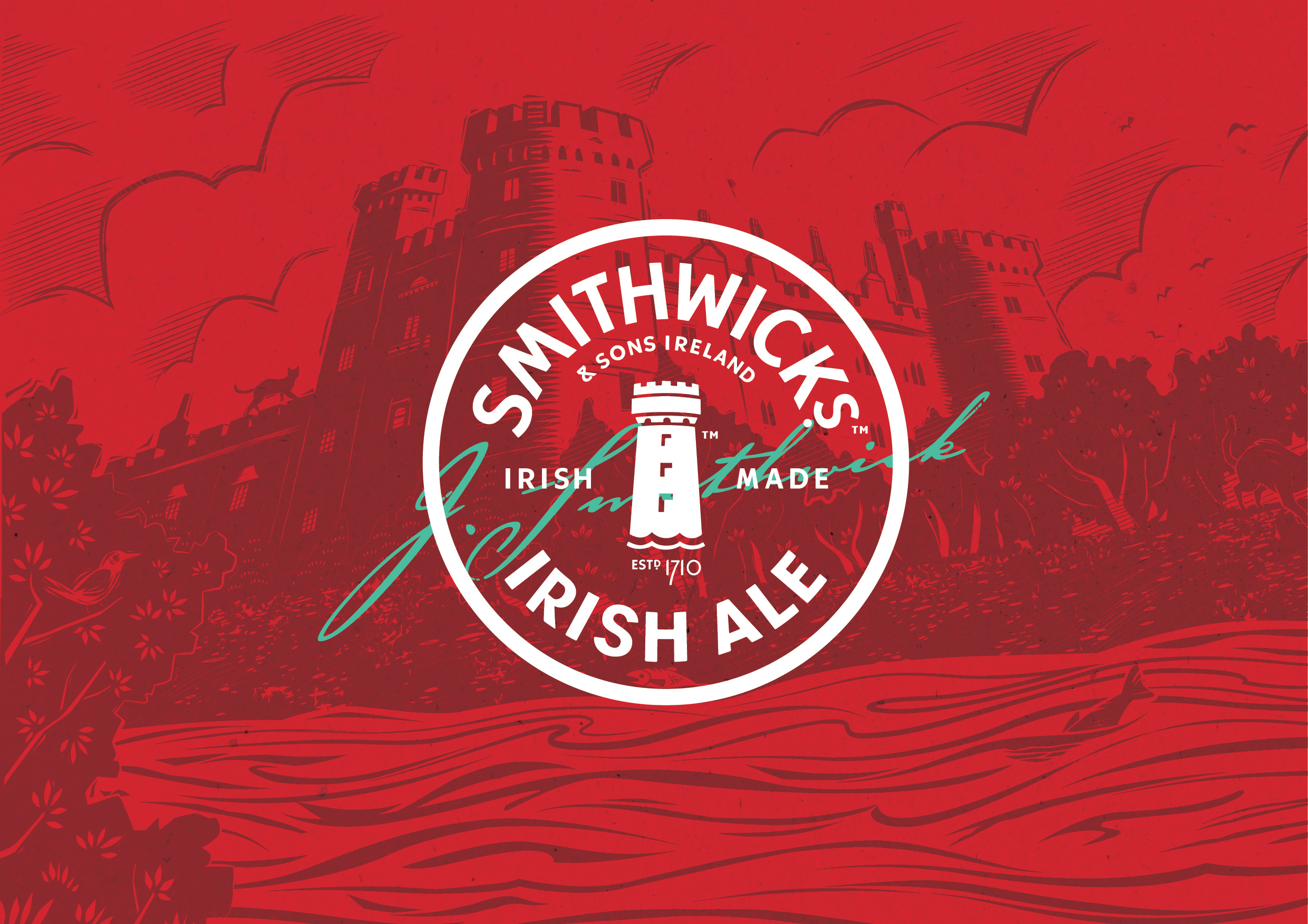
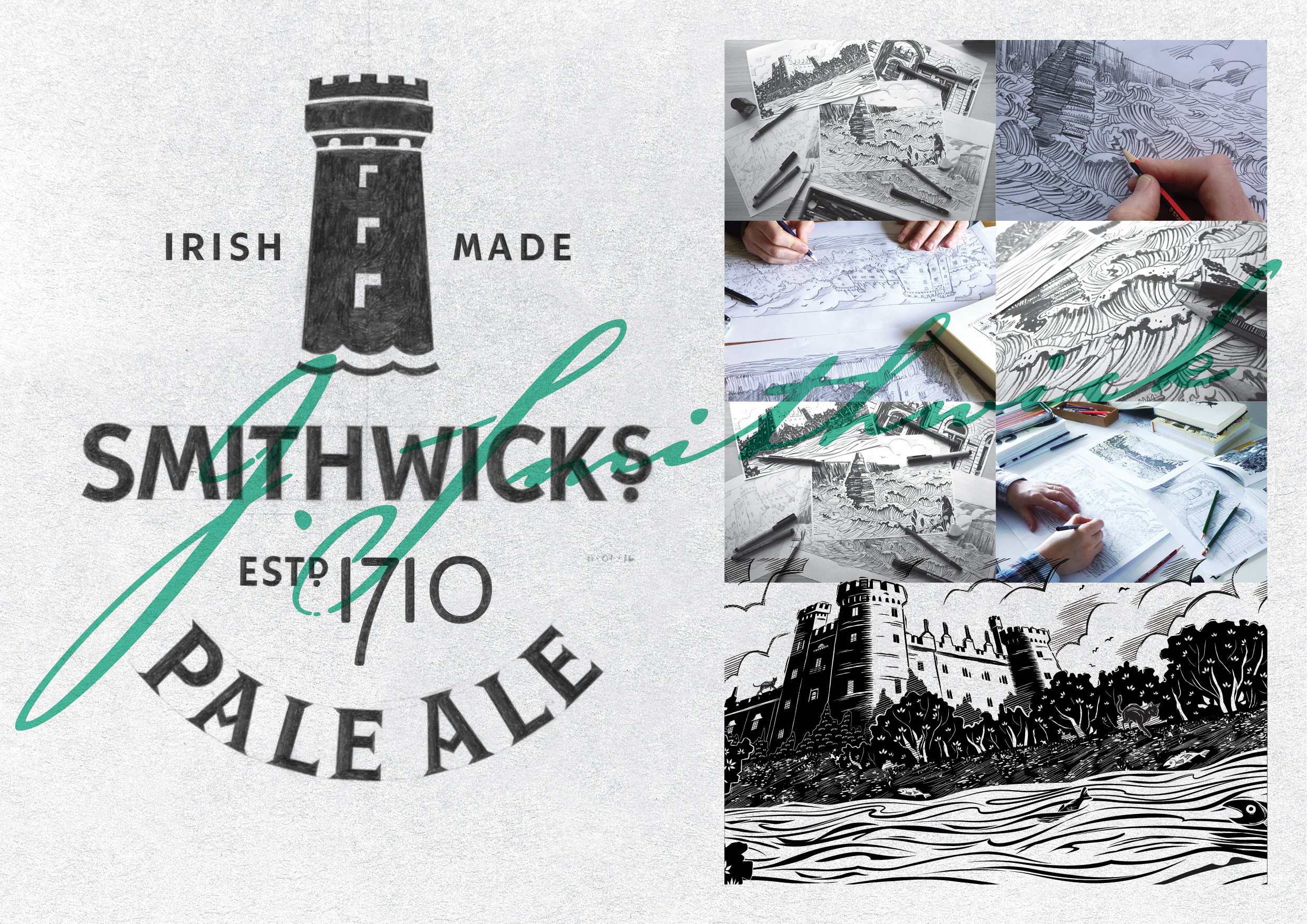
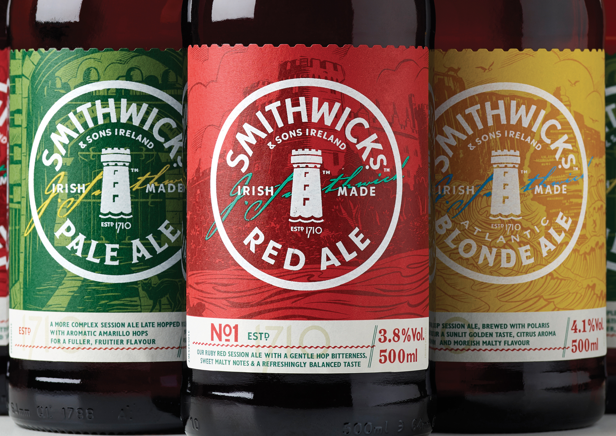
The new branding features a contemporary take on the Kilkenny castle turret which has featured at the heart of the brand since its birth. The roundel inspired by the brands very first packaging, taps into traditional beer semiotics and allows for a rich story to be told beneath. Collaborating with local Irish illustrator Peter Donnelly we created a set of illustrations that hero landmarks from pinnacle points of the Smithwick’s families journey. The brand is vibrant, bold and confident and expresses the true passion of the Irish people aiming to engage with a younger audience. Irish made since 1710.
The new branding features a contemporary take on the Kilkenny castle turret which has featured at the heart of the brand since its birth. The roundel inspired by the brands very first packaging, taps into traditional beer semiotics and allows for a rich story to be told beneath. Collaborating with local Irish illustrator Peter Donnelly we created a set of illustrations that hero landmarks from pinnacle points of the Smithwick’s families journey. The brand is vibrant, bold and confident and expresses the true passion of the Irish people aiming to engage with a younger audience. Irish made since 1710.
Project: Smithwick’s Redesign
Category: Identity & Packaging
Year: 2017
Collaborators: Design Bridge, Gerry Barney, Peter Donnelly
Category: Identity & Packaging
Year: 2017
Collaborators: Design Bridge, Gerry Barney, Peter Donnelly