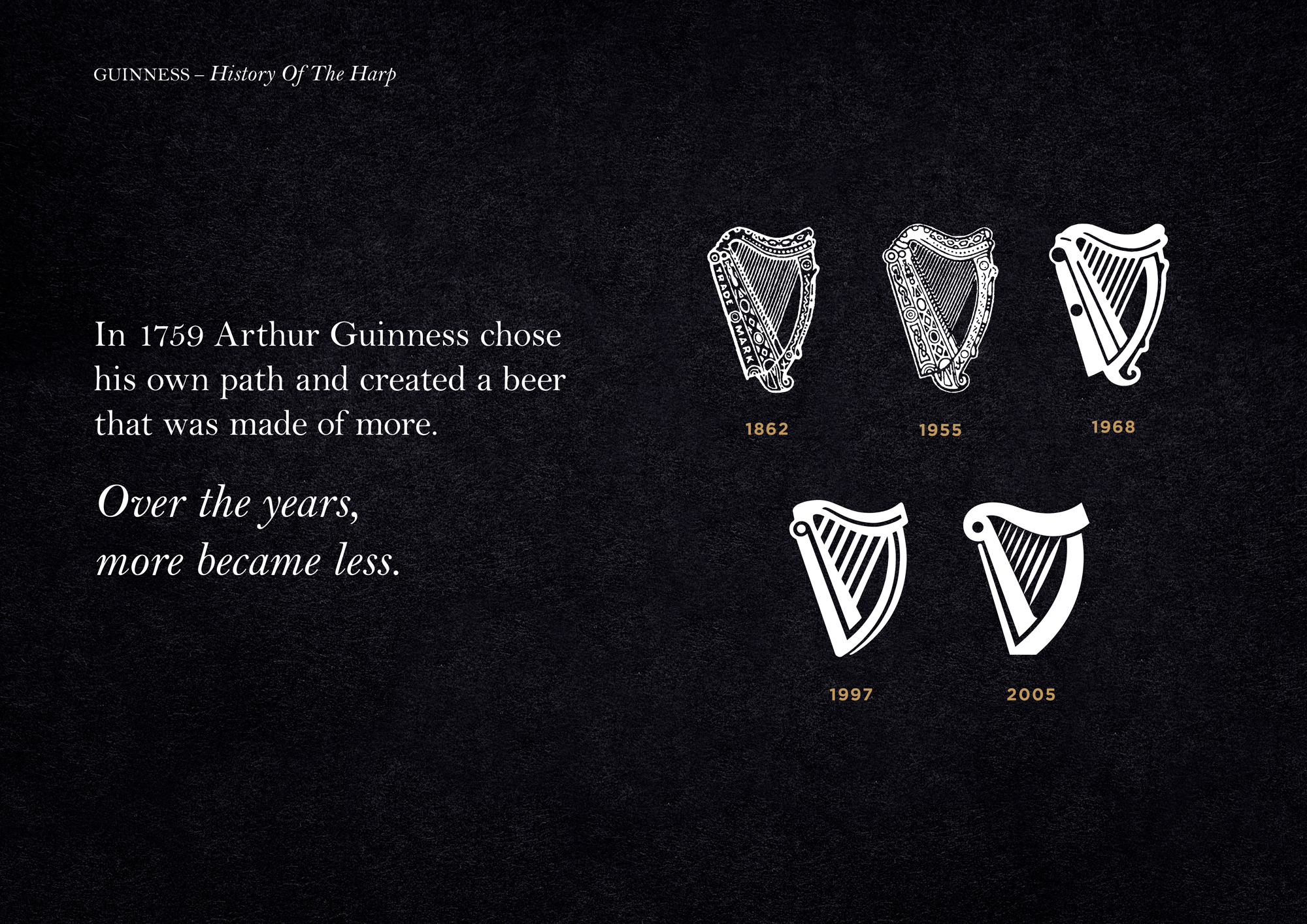
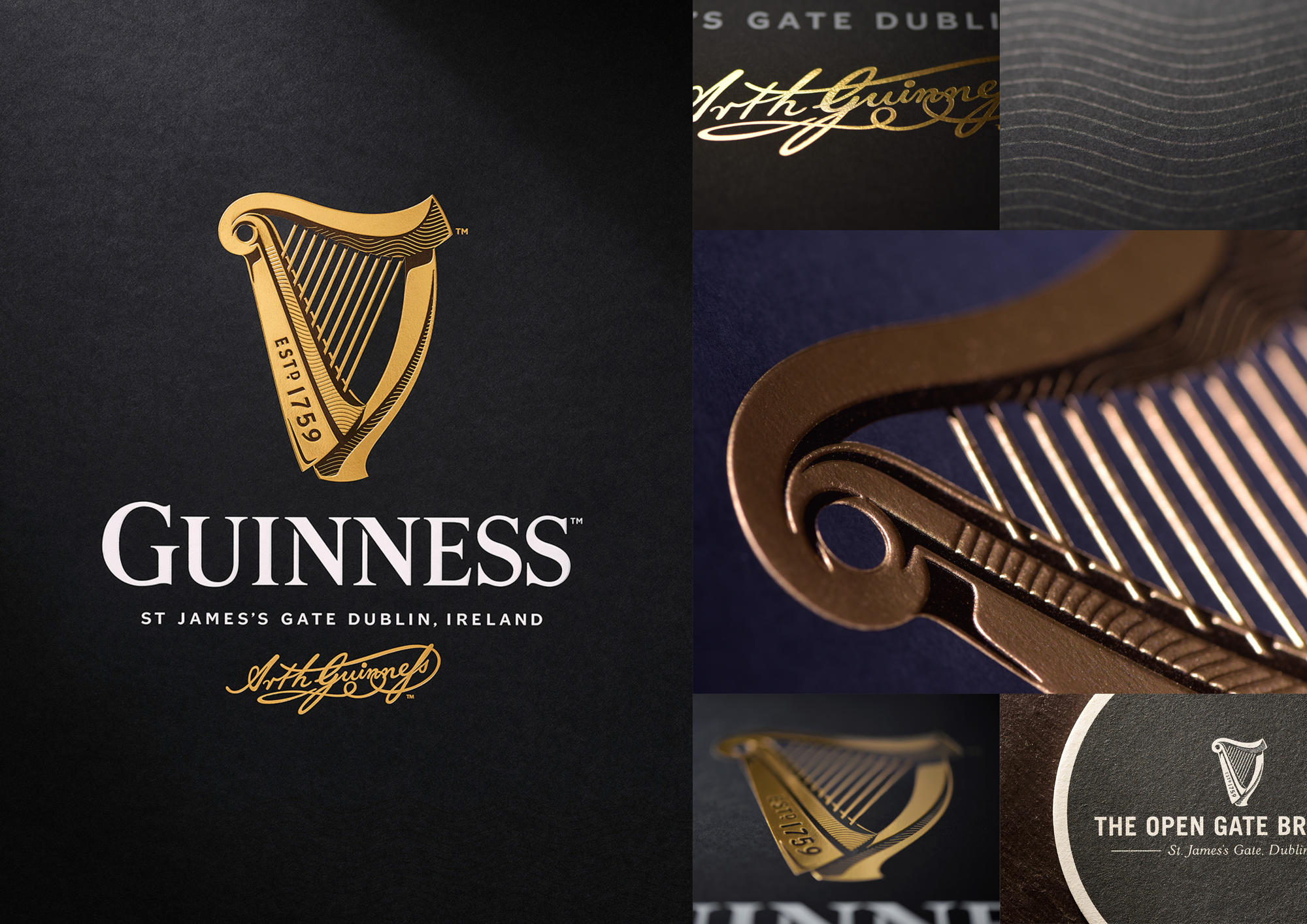
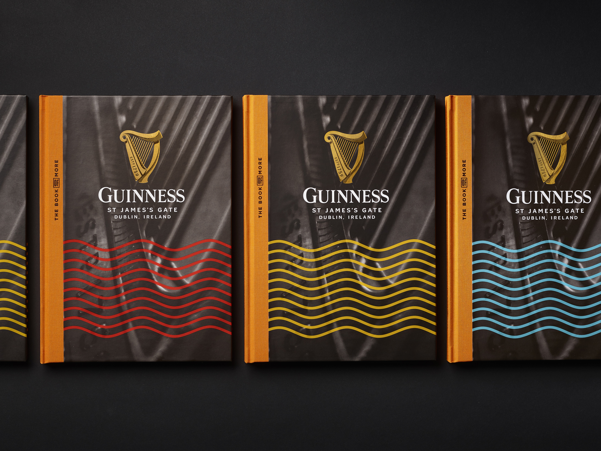
The Guinness harp. A powerful, instantly recognisable global brand mark. But in the 250 or so years since Arthur Guinness started brewing his distinctive beers, the harp had begun to lack depth and character. It had become a distinctive shape with no soul. Our challenge was to breathe life back into the harp and let it sing once again…
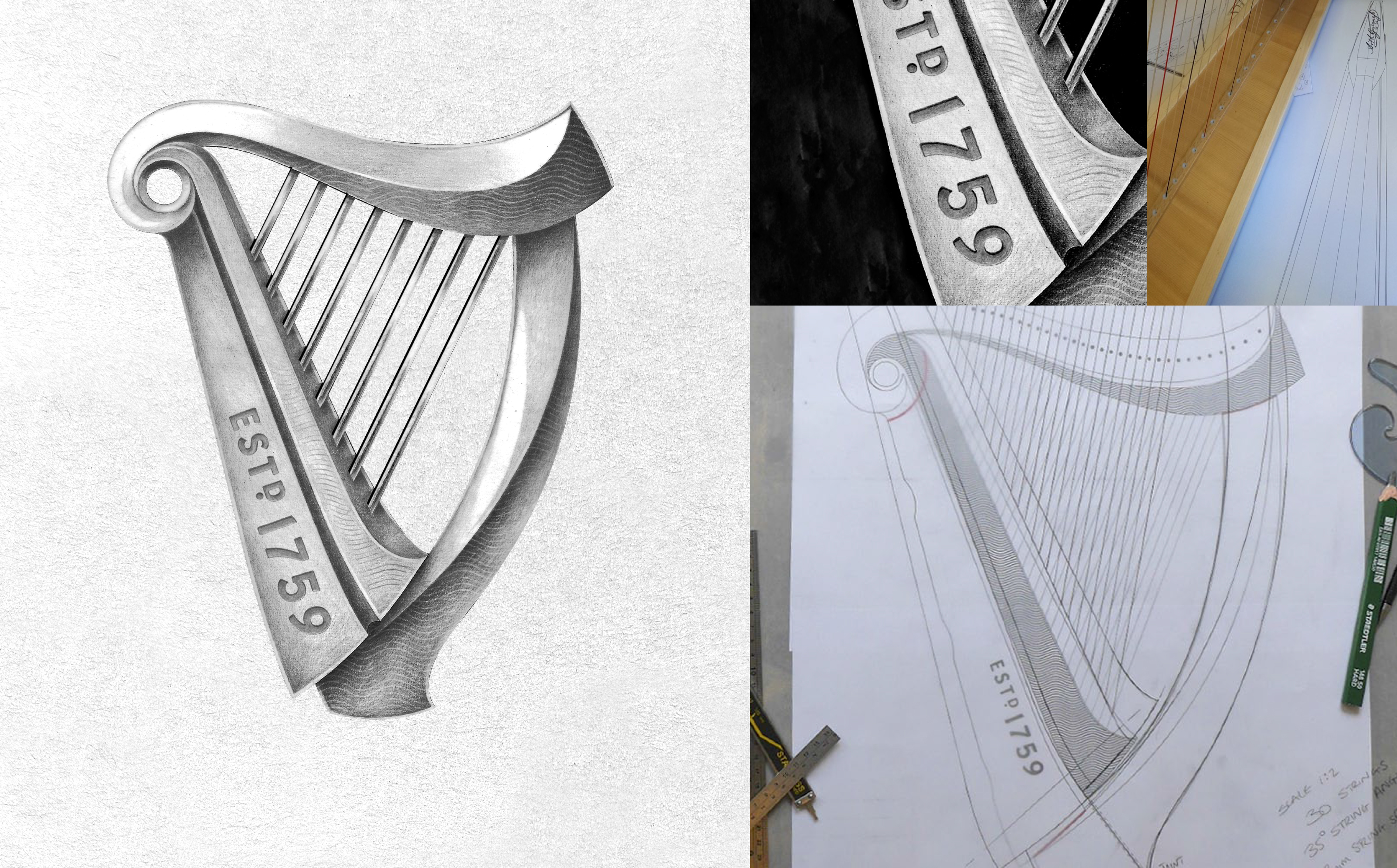
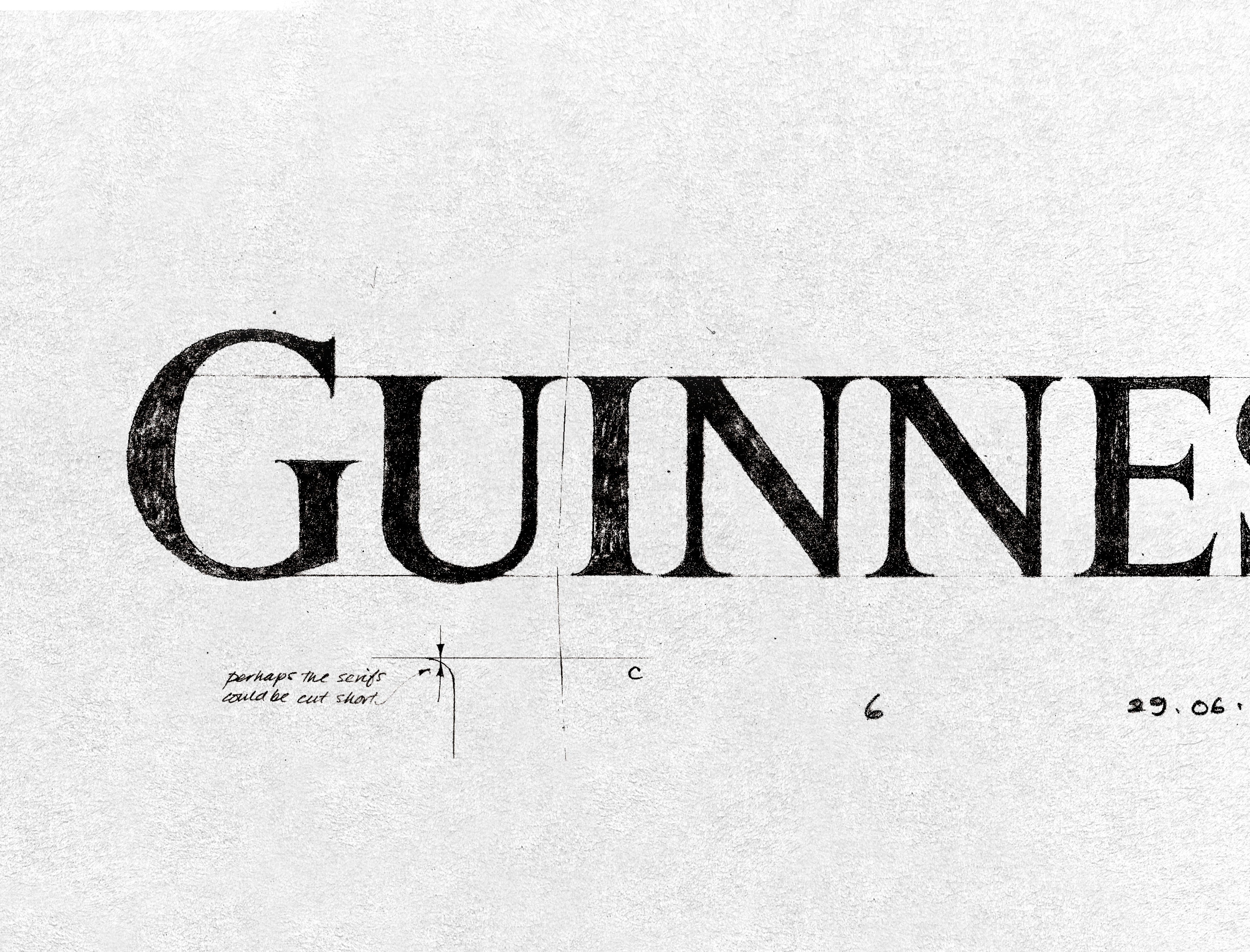
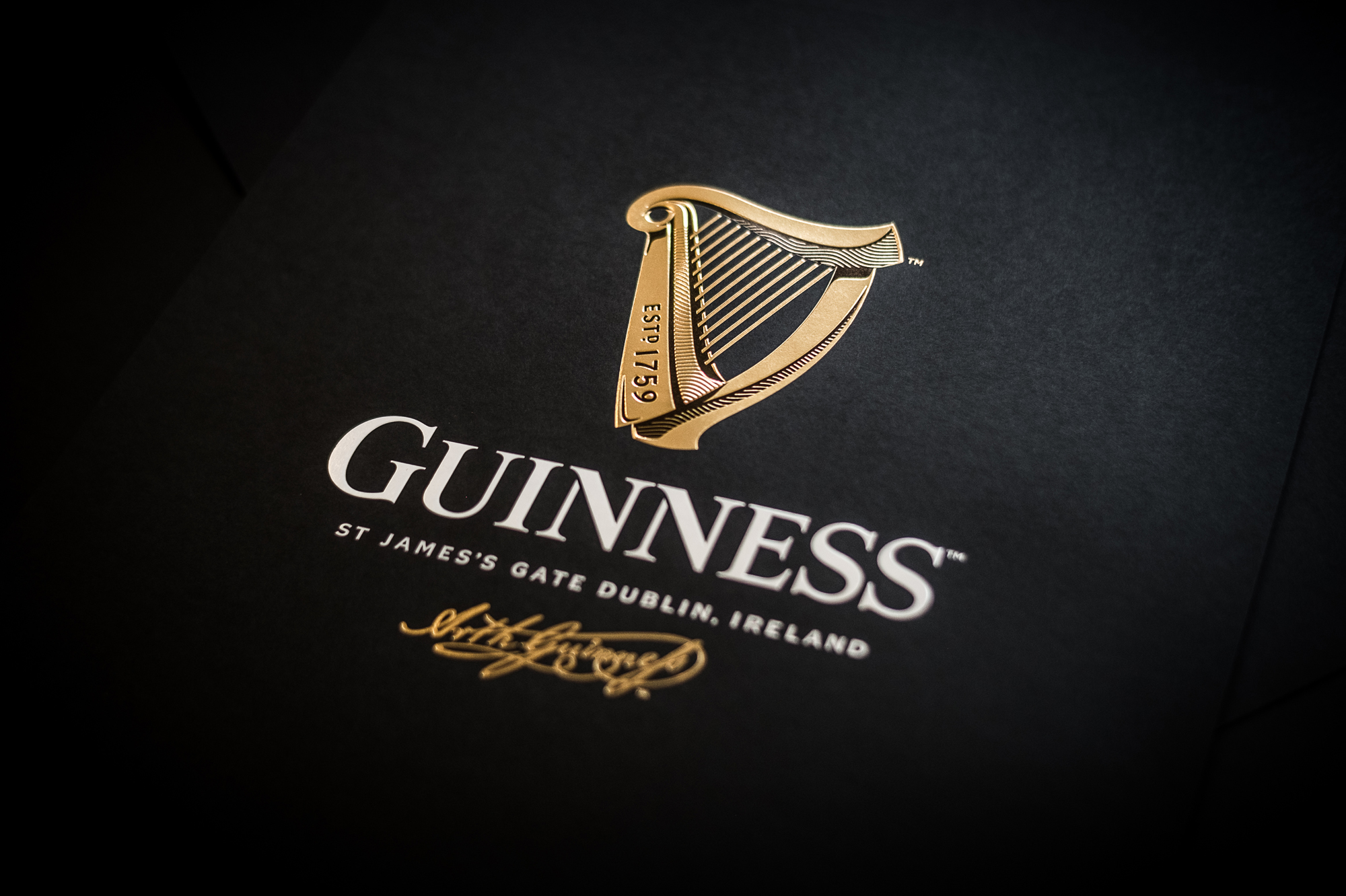
The new harp design is influenced by the rich heritage of the brand and each element has its own story to tell, such as the Est.1759 type, which can be traced back to the metal stamped lettering imprinted in the ironwork and oak barrels at the Guinness Storehouse.
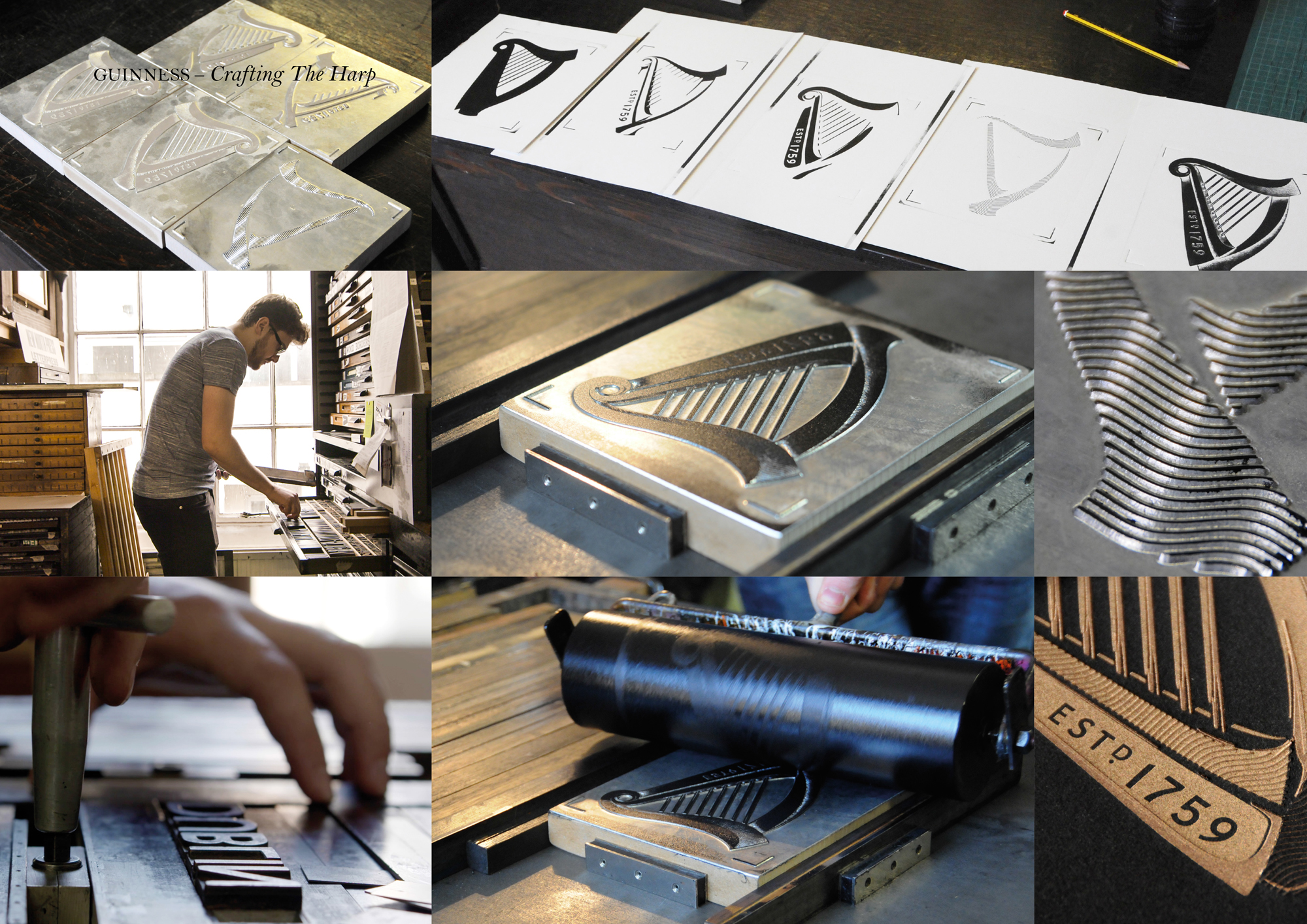
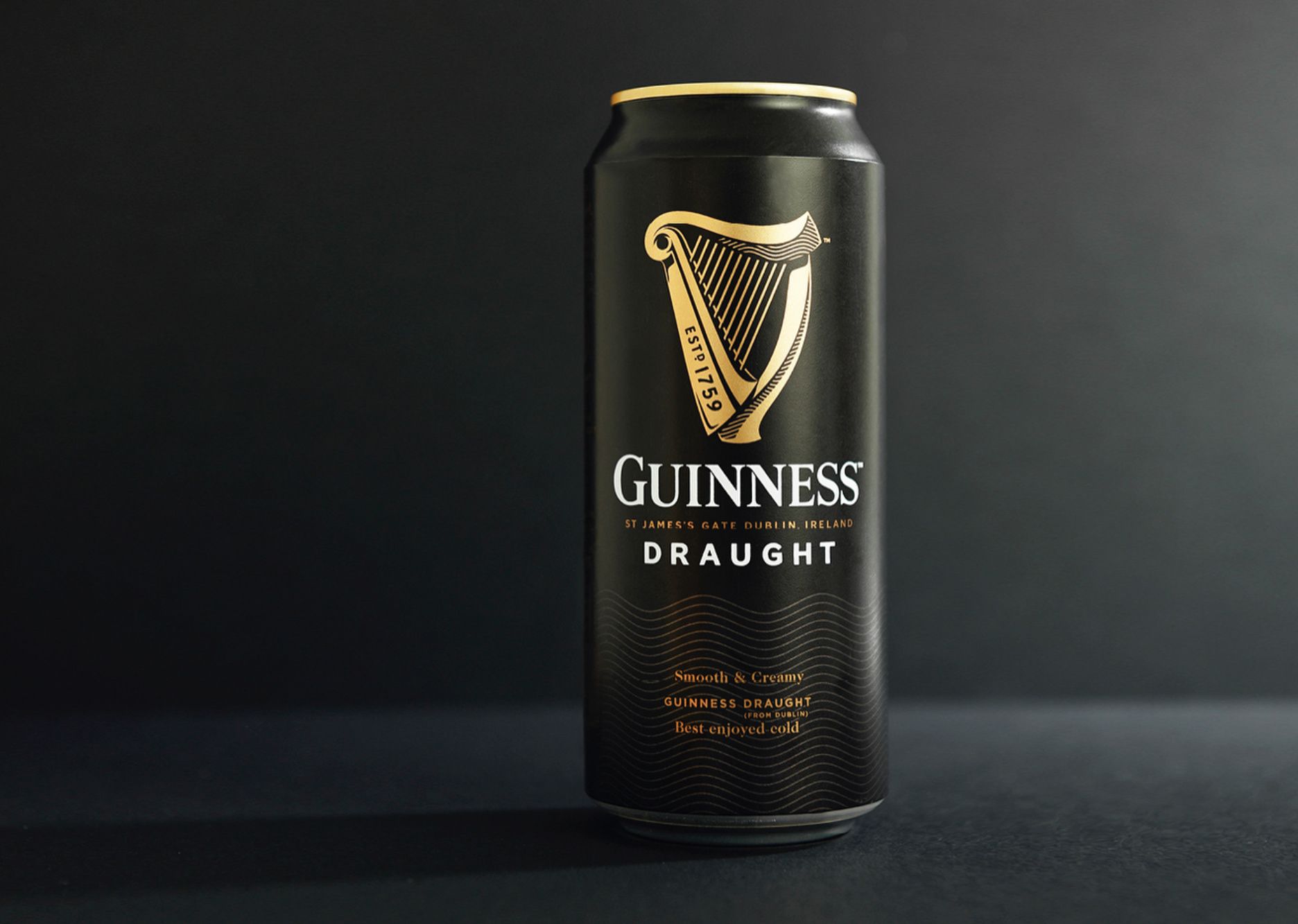
The new harp is a sympathetic revolution of the original brand mark – a contemporary take on the brand’s heritage. It can work on anything from craft beers in Europe to Limited Editions in Africa and, just like Guinness itself, has true craftsmanship at its heart.
Project: Guinness Identity Redesign
Category: Identity
Year: 2017
Awards: Brand Impact, New York Festival, Clio, FAB, The Drum
Collaborators: Design Bridge
Category: Identity
Year: 2017
Awards: Brand Impact, New York Festival, Clio, FAB, The Drum
Collaborators: Design Bridge

